I recently had the chance to do an illustration for two poems by Mitchell Nobis and published on Hobart for their yearly baseball issue. They are beautifully written and worth spending time with. Brew something hot, take a deep breath, read them, savor them, and enjoy the power of poetry.
Where do we begin?
That’s the question after reading them and sitting with the words for a few minutes. Here are things I considered on this particular illustration:
There are two stories here that— as far as I could tell— aren’t connected to each other so do I pick one to represent? If so, which one?
What do I want to do: bring a moment from words into the visual such as when Henry slides short and is tagged out or contribute something that happened outside of the text before or after the reader appears?
Or do I want to create a piece that can exist as a bridge to link the stories into one?
These are bigger questions and— for me— happen before I think about which medium I am going to work in. If I can find an idea that excites me and enhances the words without the reader even thinking about it, I will have done what I set out to do.
The task at hand is already impossible, but I start working and hope the creative gods give me some grace.
What stuck out to me:
These stories are about Baseball as much as they are about baseball. Does that make sense?
The little notes of Why can’t we lead off in my league? are about baseball but so is a father and son playing catch in the yard, bonding over a shared game or the long walk back to the dugout after not even making it to the base on a slide you might have seen your hero do on tv the night before.
The unifying thing about these two to me is their warmth in the face of heartache. They are stories of people either experiencing hardship— Henry/Hank getting tagged out— or difficulty on the horizon— the son on the precipice of entering a new, harder league that will only get harder as he gets older and the father seeing what is coming.
They are stories that exists in a liminal space, a place in time that is between states. Between one season and the next. Between one at bat that ended well and another that we don’t know how it will go.
Great stories exist in liminal space and I want my illustration to reflect that.
The Sketchbook
The next step was to put pencil to paper and start to explore composition, subject matter, tone, and find the things that I thought worked well with the idea. This is a time to ask the inner critic to please find something else to worry about. Drawings are meant to be good (or even looked at by anyone else). They are meant to think on the paper.
Lots to look at here. Mainly just playing on paper. Trying things, think little couplets instead of launching into a sonnet. Going from left page, top-to-bottom to right page, top-to-bottom:
The dimensions and where the logos were going to go. Doesn’t matter if I have the best idea, if it doesn’t fit in the given dimensions of a the site, nothing is going to work
A glove holding a heart instead of a baseball. hmm interesting. I will circle back to that
a very rough sketch of a kid throwing a ball. This was actually the first thing I drew just to get my brain thinking baseball. I pulled up some reference of kids playing catch and tried to squint and see something. This is unfinished because ideas were already starting to show up.
Moments from the pieces: a father catching still in his tie from work, Henryholding his head as the moms boo, and a father and son talking as they break from the throwing
I really liked the last one on that page with the oversized jersey, the legacy swallowing him, but it just didn’t do it for me
NEXT PAGE!
Ying yang, baseball, two stories?!? Happy Sad?
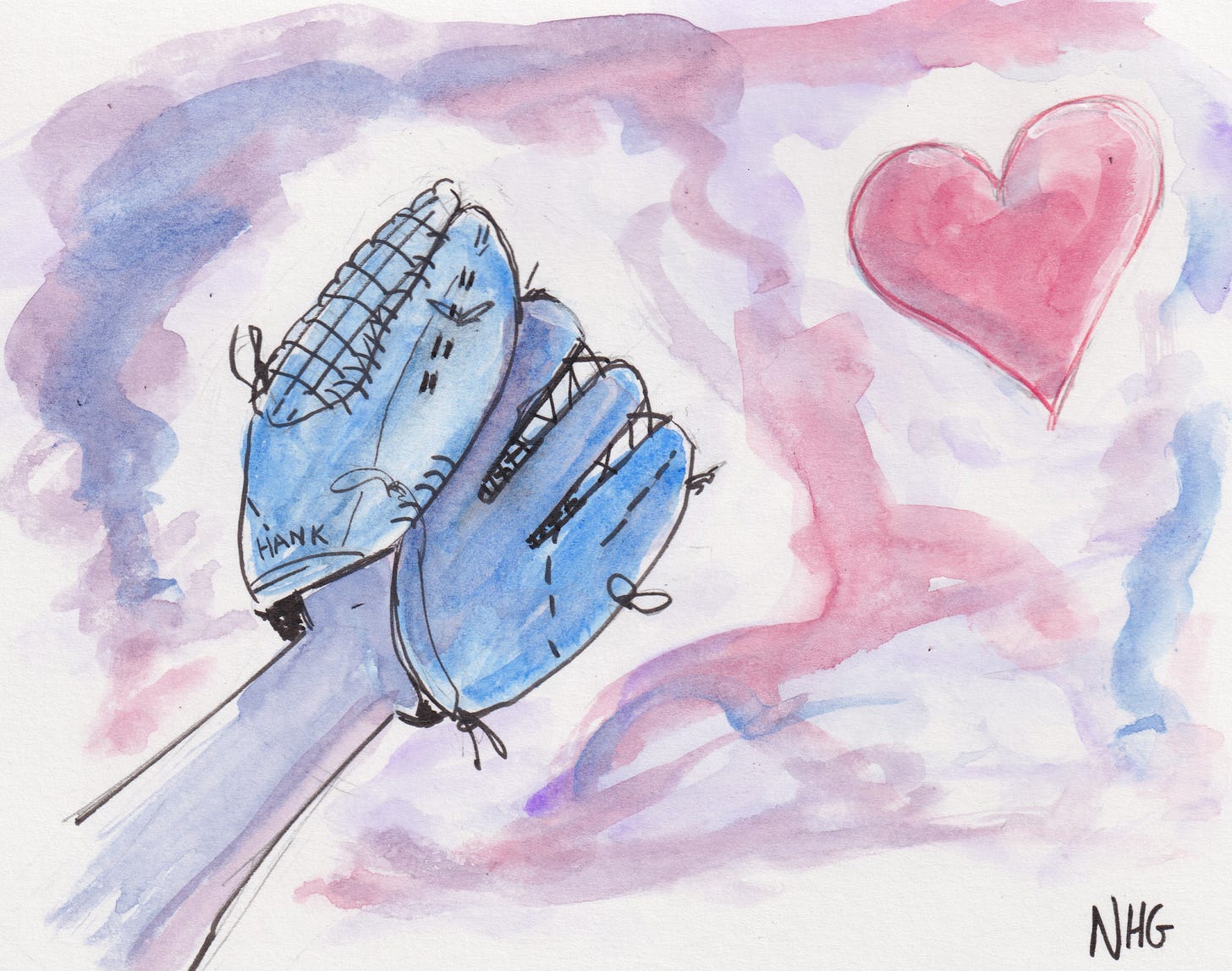
Lots of catching compositions. and one which would end up being pretty close. colors were more true to the actual thing, but getting there. The heart is no longer at rest in the glove. It is about to be caught— or dropped.
Other thumbnails with the title blocks added in. Tried putting the heart in the glove closed up, but that didn’t read well I thought.
The idea of a tableau as a way into the mind of the young players’ lives through their ephemera: a bat, a signed ball, a jersey. These things are what the character would probably want to show us if we were in his room because maybe those are what drives him to be who he thinks he is at that point.
Finally a few more placed directly on the words because maybe that will yield something interesting. I was very close to doing the bottom left one: a young man weeping in an empty dugout. I began it on the back of the paper that would hold the final drawing, but ultimately erased it totally. I just didn’t think it was the whole picture to sit alongside both poems. I think if it was only Baseball Dust I could have rallied around it.
There is also an idea similar to the ephemera previous with a series of family pictures on the stairs telling the story of baseball being passed through the family as time went on because I felt that was a strong theme.
I decided to go with the sketch in the top right that was similar to the sketchbook thumbnail because of the reaching towards the heart, but not yet in the glove because of the chance it won’t be caught. The glove, the player is outstretched and hoping. There is tension in this moment after it has been thrown but before it is caught, much like we talked about earlier in the pieces.
Color
What is the color of baseball? Perhaps it is the deep brown of a worn glove, the brown of a wooden bat. Maybe the green of the grass that you almost can’t replicate in your own yard.
I think of red and blue: MLB logo, team colors for 10+ teams, American flag waving during a national anthem, etc. So it was a easy simple palette to use: a red and a blue and a purple by combining the two.

The Painting Itself
Sadly, I did not take production photos.
Sketched out in pencil1, then inked in black waterproof pens2, and colored with blue and red watercolor3 all on Strathmore bristol4 (Vellum)
A small amount of digital cleanup later…
and that is how we go from two poems to two poems and a drawing. I am grateful for Mitchell and Aaron Burch5 for letting me contribute to the baseball issue and be on the same webpage as these two stories.
I have learned it nurtures my creative soul to know and see good work out in the world. I am a better writer for drawing these pieces. I hope you find good art soon to nurture you.
Papermate Sharpwriter 0.7 mm with the clip shaved down. Just don’t like the feel of that piece as I twirl it in my hand, thinking, but gosh do I enjoy sketching with these.
Tombow Fude Pen (Soft)— aka the worlds best fude pen— and a Sakura Graphic 1mm for larger areas of black. Big thumbs up for both!
Winsor and Newton cobalt blue and alizarin crimson I think. Like 80% sure.
I don’t like this paper for watercolor that much because you really can’t get it up well like you can with real, cotton watercolor paper. But part of me thought about coloring it digitally, but I was just in a groove so Bristol + watercolor it is! I also think next time I’m going to try smooth instead.
Aaron is a literary fairy godmother who spreads good things across the internet with all of his literary endeavors to undeserving souls like me and I don’t know how to repay him for everything he’s done for me in just 2022 alone.


